 Photo by Igor Miske on Unsplash
Your website is the face of your business. Typically, it’s the first place your target audience will connect with you, so you must ensure it offers the best user experience possible.
The user experience or UX of your website refers to how visitors feel when navigating your site and how the design facilitates the customer journey. Essentially, you need to ensure it’s easy and enjoyable for users to navigate your site, understand your message, and ultimately convert.
You must provide a positive user experience to capture as many leads as possible. If you don’t, potential customers will likely become frustrated or confused, which will cause them to leave your site in search of a more fluid and enjoyable experience.
So, to help you out, here are five expert tricks you can use to create a fantastic user experience that will attract new customers, drive conversions, and improve your company’s bottom line.
1. Ensure your website’s menus are intuitive
It should be effortless for website visitors to locate exactly what they need on your website. If they cannot, users will be far more likely to leave without making a purchase, hurting your sales numbers and bounce rate.
To create an intuitive navigation experience, you should tailor your menus to your target audience. When designing these, consider structuring them by:
- The type of person a visitor is, such as a teacher or student
- By product type
- By the problem they are having so they can find solutions quickly
Break your menus down naturally to help users easily find the unique path that will allow them to explore your site with ease. Consider how your customers would most commonly refer to the different items you stock, too, then make sure you’re speaking to them in their language.
Let’s look at a company that successfully uses intuitive navigation menus to enhance its user experience and drive sales.

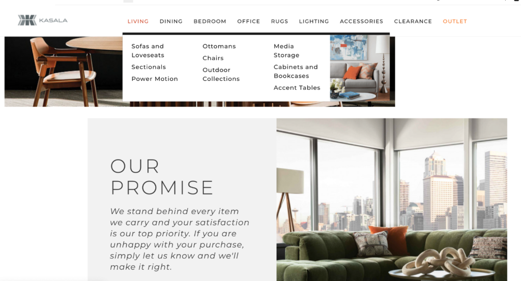
Kasala, a Seattle-based furniture company, offers their customers high-quality home furnishings and top-tier customer service.
Their website reflects these goals by providing an incredibly intuitive browsing experience. Notice how they segment their menu by room, making it easy for customers to find the type of furniture they are looking to purchase. The company then further segments its categories by product type, like dining room tables and chairs. This not only helps to neatly organize the items they sell, but it also reduces the number of clicks a customer has to take to get from the homepage to the product page that they are looking for. This then provides a very quick and convenient customer experience.
This approach typically works well for online stores that need to layout their vast inventory in a streamlined manner. This will enhance your website’s user experience and inspire customers to make a purchase.
2. Take steps to reduce your website’s loading time
Your customers are in a hurry and, if your website doesn’t load quickly, they will likely leave to find similar products or services on a competitor’s website. This means you must ensure your website loads quickly to prevent users from bouncing to a page with a better UX.
Studies show that, after 3 seconds, your users grow impatient while waiting for your page to load. And, if it takes more than 4 seconds, 40% of customers will already have bounced, hurting your conversion rate.
To understand what is having a negative impact on your website’s load time, do some independent research with a tool like Google PageSpeed Insights. This will give you an idea of how long your website takes to load and what is likely to be slowing it down.
You can often improve your load times by eliminating unnecessary plug-ins from your website and compressing your images. There may also be some bigger problems you need to address.
All of these factors can help your pages load faster and ensure your customers stay on your site instead of leaving to visit a competitor.
3. Help people to convert in as few clicks as possible
Online shoppers love convenience. So, the shorter their purchase journey is, or the less time it takes to book your services, the better.
You must reduce the number of clicks it takes for someone to find what they need and spend money on your site because your customers will want to find solutions to their problems as quickly as possible. You can do this by streamlining your navigation paths and making your purchase process as quick and easy as possible. Elements like a clickable call to action (CTA) button or a sophisticated search tool can help your customers find the products or services they need in less time.
Let’s look at a company that effectively streamlines its conversion process to ensure it’s easy for website visitors to turn into customers.

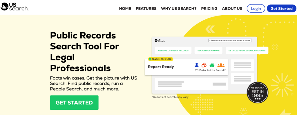
US Search is an online tool that helps customers conduct public records searches. Since their target audience is legal professionals, they must ensure the conversion process is clear and straightforward, as website visitors are likely to be short on time.
Notice how they use a prominent call to action button on their homepage that tells people how to move forward with conducting their search. Their menu at the top of the page also makes it easy for visitors to learn more, and the CTA is surrounded by a strong value proposition that tells the audience exactly what the service provides and how it can help them win more cases. Once users click on the CTA, they are directed to a page where they can input their information and begin the process of working with the company — it’s very quick and simple.
You can use this strategy on your website by placing a prominent and easy-to-understand CTA button above the fold of your homepage or landing page. This will direct users to move forward with your company and make it easy for them to convert.
4. Consistently publish valuable content that benefits your audience
Another way to make your website more engaging and ensure people enjoy visiting it is by publishing great content. This helps to provide a better UX for your website visitors and will establish trust in your brand because people will see how knowledgeable you are through the content you offer.
To create content that provides actual value for your ideal customers, you should:
- Write about topics that matter to your audience and offer valuable insights. You can look at industry forums to see what people are discussing and what they would like more information about.
- Create content that addresses common questions and pain points for your readers. You can use a tool like Ahrefs to find common questions people ask online and then answer them with your articles.
- Highlight what your company does well and how it can help your customers.
Your content should also be optimized for SEO to ensure you rank higher than your competitors in relevant search engine results and drive more traffic to your website. You can begin by targeting keywords users enter into search engines when they’re looking for content like yours. This will ensure the right people find your articles when doing their own research.
Now, let’s look at two companies that use their content to attract their ideal customers and offer an enjoyable user experience.

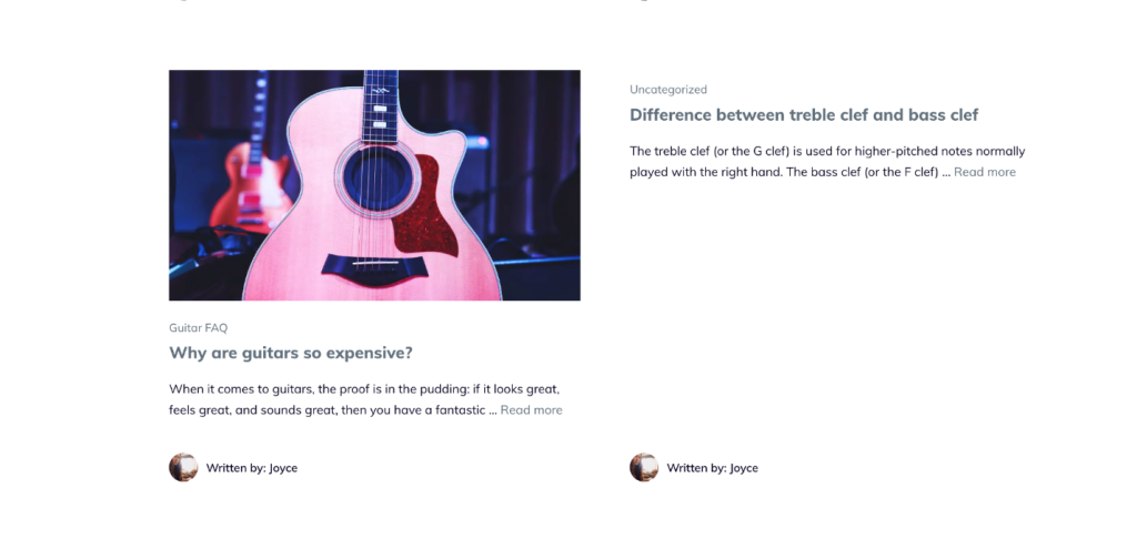
Musician Authority is a website dedicated to helping musicians at the start of their craft. They regularly publish valuable content that answers common questions or clarifies important terms for novice musicians. They also publish in-depth information about common topics that matter to musicians, like the difference between a treble clef and a bass clef to help educate people who may be new to playing an instrument.
This particular article provides definitions of what a treble clef is, what a bass clef is, and how the two elements work together to create a harmonious musical piece. This depth of information ensures that their target audience can use the content to improve their craft, and they’ll likely continue to turn to Musician Authority for guidance as they learn to play their instrument.
You can use a similar strategy on your website by choosing content topics tailored toward your ideal audience and helping to answer common questions they may have.

Another company that uses its content to offer a high-quality user experience is CrowdStrike, a security business that offers superior protection from cloud security challenges, such as cyber attacks, breaches, and ransomware.
Their content provides a lot of detail about the services they offer, making it easy for visitors to see whether or not this company can support them. Writing in-depth articles about the challenges their clients tend to face is also a great way to reach the right people, show off their expertise, and secure more clients.
For example, the company’s article about different types of cloud security risks and threats offers readers an overview of the different types of security risks companies face and how they can address them. This type of content establishes CrowdStrike as an expert in the industry, and creates a great user experience for readers looking to address cyber risks for their company as it provides lots of information about cyberattacks that customers can use to improve their online security.
You can use this strategy of writing in-depth content that benefits your audience by exploring and solving common issues customers have, as well as answering frequently asked questions through your blog posts. This will remove any confusion or frustration from your readers’ minds and allow them to easily convert.
5. Focus on improving your website’s accessibility
Not all of your potential customers will have the same abilities. This means you must make your website accessible so that everyone can use it, even if they have specific disabilities that mean they need accommodations to access your website properly.
There are many ways you can make your site accessible, such as:
- By adding alt text to your images to help screen readers describe the graphics
- By transcribing your videos so hearing impaired users can understand the content as they consume it in a manner that works for them
- By ensuring your website’s text contrasts well against the background by using darker font colors — a classic black on white is always a safe choice
When you ensure your website is accessible to all, you’ll demonstrate that your brand cares about each and every visitor. These measures will also enhance the UX of your website and allow all customers to purchase from your site.
Summary
To ensure customers stick around long enough to convert, you must provide a positive user experience with your website. This means making it easy for them to access your website, learn about your products, and grow to trust your brand.
Remember to cater to all of your visitors and make it clear why they should do business with your company. Make it simple to navigate your site with intuitive menus and straightforward CTAs, too. If you can craft an enjoyable UX, you’ll see an increase in conversions, and your bottom line will skyrocket.
–
Author bio & headshot:
Adam Steele has been writing about digital marketing and SEO for 11 years. He’s consulted for businesses small and large, including several of the largest companies in the world. If you liked this post, follow him on Twitter and LinkedIn for more like it.


