
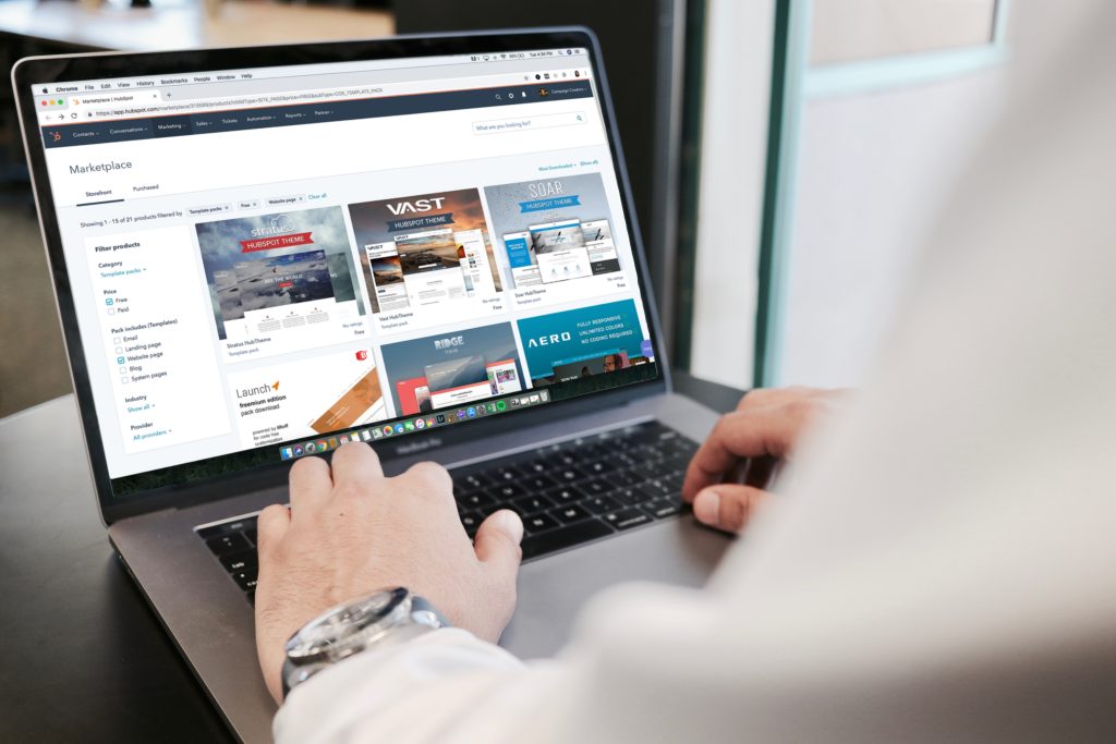
 Photo by Campaign Creators on Unsplash
A poorly designed website will make your brand look unreliable and cause navigation issues that will lead users to leave your site in search of one that is professional-looking and easy to browse. So, if you aren’t quite getting the volume of sales that you would like, some simple design tweaks could help.
Let’s take a look at six web design techniques you can use today to drive sales.
1. Make customers’ lives easy with an intuitive navigation menu
Potential customers will come to your website in search of products or services they need. But, if they struggle to find what they are looking for, they will be likely to leave without making a purchase. This will hurt your online business’ profitability as more and more customers turn to your competitors.
To ensure customers can easily find what they need, you’ll have to offer an intuitive menu. There are some tricks you can use to achieve this, such as by:
- Sorting products into logical categories to help people find related items
- Placing the menu in the upper corner, where most customers will look for it
- Using breadcrumbs to help visitors find their way back to the start of their search
- Making it easy for customers to find your homepage by linking your logo
For inspiration, let’s take a look at a company that offers an intuitive navigation to guide customers through the conversion process on their site.
Squarespace, an online website building tool, has a drop-down menu that contains all of the most popular pages so first-time visitors can find exactly what they need. They also offer a resources menu to help visitors find additional pages. By splitting their menu in this way, they prevent information overload and streamline their visitors’ navigation process.
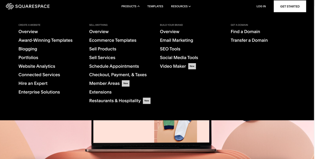 You can use the same strategy on your website by creating multiple menus to clearly lay out your products and services for your audience. This will help them to find what they are looking for as quickly as possible.
2. Ensure hiring or buying from you is as simple as possible
No matter what industry you operate your business in, customers will want an easy purchasing experience. The easier it is for someone to move forward with your business, the more likely they will be to convert.
You should always ensure people can quickly take the next step on your website without any hiccups or problems. This means you must get your web design just right to accomplish this.
Place all of the critical information above the fold to ensure customers can figure out how to move forward with your company. And provide a search tool or a call to action so they know exactly where to click to move forward. It might seem simple but a lot of consumers don’t convert because it takes too long to work out how to do so. Therefore, if you can remove any friction and risk of confusion, you’ll be on to a winner.
3. Make it easy for people to contact you from any web page
If prospective customers have a question or concern, they will want to contact you right away. If it’s challenging to do this, they will likely leave without buying your product or service.
So, when designing your website, place your contact information in a prominent place, like the upper right-hand corner of your header. You can also include it in the footer of each page or link to your “Contact Us” page in your menu.
Offering multiple means of communication will also allow your customers to choose the one that works for them. Always make it easy to get in touch with a real person and focus on keeping turnaround times brief. This will show that your company values its customers.
Take a look at this example from LawnWorx, a lawn care and pest control service. They knock it out of the park by displaying their phone number and availability hours right at the top of the page. This ensures their audience knows when they can speak to a representative or ask questions that require a swift response. They also include a link to their contact page, where they offer an additional method of communication to potential and existing clients. This makes it easy for customers to connect with the company in the way that works best for them.
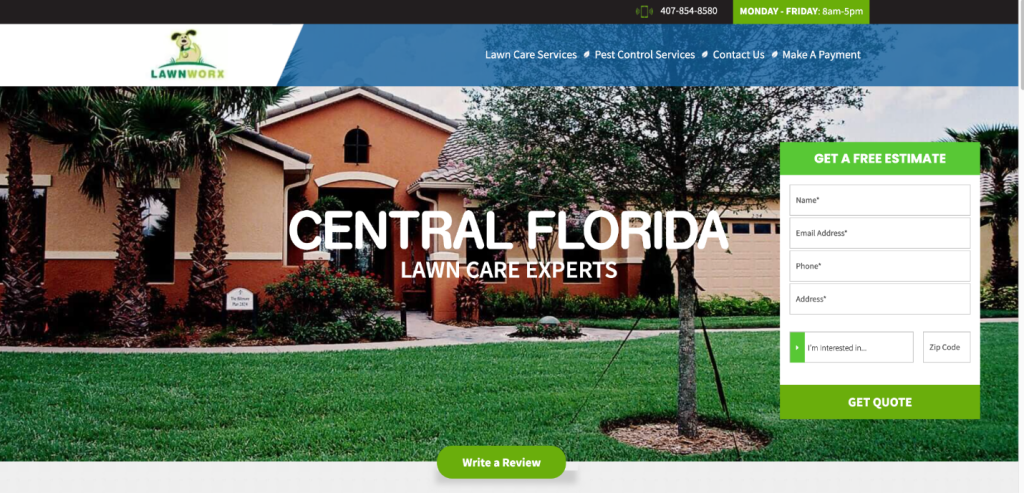 You can use the same tactics on your website by ensuring each page offers multiple ways to get in touch with you. It’s also a good idea to manage people’s expectations by outlining your office hours — this way, nobody will be sitting waiting for a response while your customer service team isn’t available.
4. Always use imagery that shows your business in the best light
Your website’s imagery is what will draw visitors in long before they read your copy. So, use images that reflect your brand’s personality and showcase the people behind the scenes to make the best impression.
To show your business in the best light, you could:
- Provide pictures of your employees to put a face to your company.
- Give visitors a behind-the-scenes peek at your warehouse or offices
- Share pictures from company events or of new hires
- Choose photos that support your brand’s messaging
- Post images of real people using your products or services
For inspiration, let’s take a look at this great example from Doors Plus, a company that helps homeowners choose custom doors for their homes.
They do a great job of using images that show how helpful their staff are and how great their products look. For instance, this homepage image shows two customers speaking to an employee in their showroom. They also use many photos that showcase their products in real-life settings, helping customers imagine what these items would look like in their own homes.
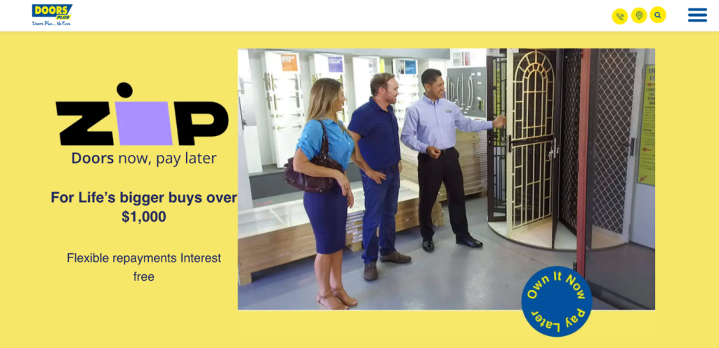 You can apply the same strategy by showcasing pictures of your employees interacting with customers and showing the benefits of your products or services. This could go a long way towards encouraging people to convert on your website.
5. Showcase proof of your abilities on key pages
Potential customers will need peace of mind before they move forward with your company. A great way to make them feel more comfortable is by adding multiple forms of social proof to your website.
Social proof shows that other people and companies have vouched for your products or services. It offers a great way to boost conversions because it helps visitors see that your business is credible and you’re good at what you do.
The first step for collecting social proof is to quickly do an internet search on your own company. Capture any mentions of user-generated content that positively represents your brand and share those mentions on your site. You could also provide statistics that show the kinds of results you’ve achieved for past clients, or shine a light on any big names you’ve worked for to gain your audience’s trust.
Let’s look at a company that does a great job of using social proof on its website to build trust with its customers.
Crescent Canna, an eCommerce company that sells CBD products, have displayed customer reviews and star ratings right on their homepage to show new visitors that real people have tried and enjoyed their products.
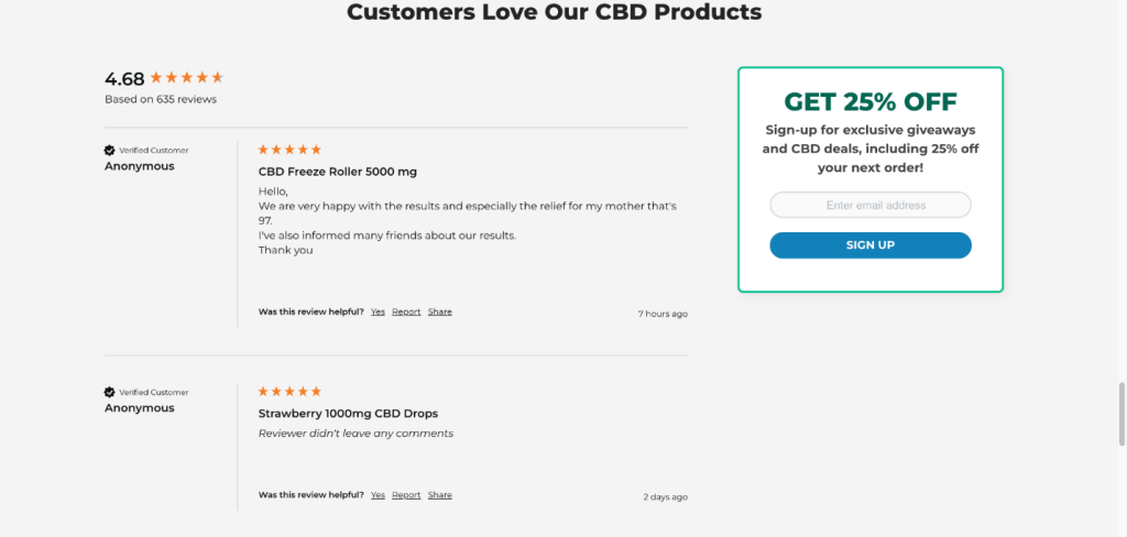 Notice how they’ve included an average star rating, as well as the number of reviews they’ve received. This shows the scope of their brand reach and how many customers have enjoyed the company’s products. It also means there are reviews that will grab the attention of people in a rush, as well as those who really want to get more in-depth information about what they’re considering buying.
You can use the same tactics on your site by adding social proof to key pages. This will show potential customers that they can trust you to deliver on your promises. Include testimonials, star ratings, and any notable clients you’ve served in the past. It could do wonders for your conversion rate.
6. Harness the power of calls to action and ensure they stand out
Another great way to boost your conversions is by designing calls to action (CTAs) that stand out, making it very easy for customers to convert. Add CTAs to your landing pages, product pages, and service pages to give potential customers a clear path forward with your business.
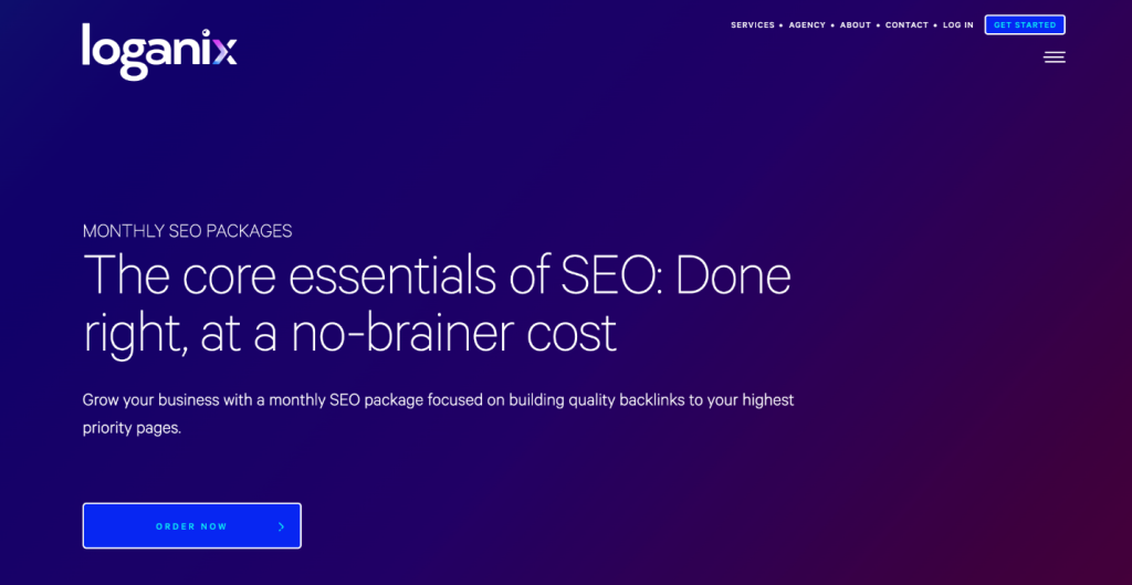
At Loganix, we use a simple design on our SEO services page to ensure our CTA buttons stand out from the rest of the page and drive people to engage with them. We have also placed multiple CTAs throughout the page with specific wording like “order now”, so people can easily make a purchase whenever they have enough information and feel comfortable.
 You can use the same strategy on your website by making sure that your CTA buttons are easy to spot, placed logically, and stand out against a simple backdrop.
Summary
If it isn’t well-designed, your website will cause your company to lose out on conversions as customers grow frustrated or skeptical and bounce to the next site. So, take the time to use these smart web design techniques to boost conversions and offer your visitors a positive user experience.
–
Author bio & headshot:
Aaron Haynes is CEO and co-founder of Loganix. The company is an SEO fulfillment partner for digital marketing agencies and professionals, which provides the services businesses need to improve their online visibility and grow. If you liked this article, check out the Loganix blog, where you’ll find more SEO guides full of expert advice.