Fix Cumulative Layout Shift in WordPress by reserving space for every late-loading element: images, ads, embeds, banners, fonts, and injected plugin blocks. If the browser knows how much room each element needs before it loads, the page stops jumping. That single idea solves most CLS problems and can lift your Core Web Vitals score faster than chasing tiny JavaScript tweaks.
TLDR: Cumulative Layout Shift, or CLS, measures how much your WordPress page moves while loading. A good CLS score is 0.1 or lower; anything above 0.25 needs urgent work. For example, a WooCommerce store with a CLS of 0.34 reduced it to 0.06 by adding image dimensions, reserving ad space, and preloading its main font. After the fix, mobile users reached the product button about 18% faster because the layout stopped hopping around.
What causes CLS in WordPress?
CLS happens when visible content shifts after the page has started rendering. You tap a button, then an image loads above it, and suddenly you tap the wrong thing. Annoying? Very. Bad for conversions? Also yes.
WordPress sites are especially prone to layout shift because they often use many moving parts. Themes, page builders, ad scripts, cookie notices, sliders, lazy loading, social embeds, and plugin widgets all want space on the screen. If they arrive late and no space was reserved, the browser pushes content around.
The most common causes are:
- Images without width and height attributes
- Ads or affiliate blocks inserted after load
- Web fonts swapping late
- Videos, maps, and social embeds with no fixed container
- Sticky headers, popups, and cookie bars pushing content down
- Sliders and carousels that change height
- Page builder sections with delayed CSS

How to check your CLS score
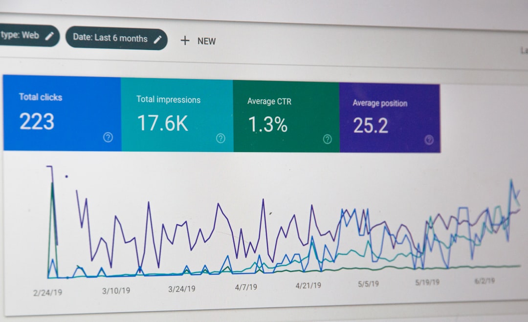
Start with PageSpeed Insights. Enter a page URL and review the Core Web Vitals Assessment. Field data is best because it comes from real Chrome users. Lab data is still useful for spotting what moved during a test run.
Then test key pages, not just your homepage. Check:
- Homepage
- Top blog posts
- Product pages
- Category pages
- Checkout or lead form pages
Use Chrome DevTools too. Open DevTools, go to Performance, record a page load, and look for layout shift events. The browser can highlight which elements moved. Honestly, it feels like detective work the first time, but one bad banner or font swap is often the whole problem.
1. Add width and height to images
This is the big one. Every image should have a set width and height. Modern browsers use those values to calculate aspect ratio before the file loads.
WordPress usually adds dimensions to images uploaded through the media library. Problems appear when images are hardcoded in templates, inserted by page builders, loaded from external sources, or added through custom fields.
Check your theme files and content blocks for image tags like this:
<img src="hero.jpg" alt="Hero image">Change them to include dimensions:
<img src="hero.jpg" width="1200" height="600" alt="Hero image">You can still make images responsive with CSS:
img {
  max-width: 100%;
  height: auto;
}
This keeps the image flexible while preserving its space during load.
2. Reserve space for ads
Ads are repeat offenders. An ad script loads late, injects a rectangle, and shoves your article down. Expect to waste time on this if you run display ads, because ad networks are rarely polite guests.
Wrap ad units in containers with a minimum height. For example:
.ad-slot {
  min-height: 280px;
  width: 100%;
}
Use sizes that match the ad formats you serve. If a mobile ad is usually 320 by 100, reserve that space. If a desktop banner is 728 by 90, reserve that too. Do not collapse empty ad containers after page load unless you handle the transition without moving nearby content.
3. Fix font shift with preload and font display
Fonts can cause text to flash, resize, or jump. This often happens when a custom font loads after the fallback font has already rendered. The fix is to load the main font earlier and control how it appears.
Preload your most important font file:
<link rel="preload" href="/fonts/main.woff2" as="font" type="font/woff2" crossorigin>In your CSS, use:
@font-face {
  font-family: "MainFont";
  src: url("/fonts/main.woff2") format("woff2");
  font-display: swap;
}
font-display: swap improves perceived speed, but it can still create a small shift if the fallback font has very different spacing. Pick a fallback font with similar proportions. If your brand font is wide and your fallback is narrow, the text will move.

4. Give embeds a fixed aspect ratio
YouTube videos, Google Maps, X posts, Instagram embeds, and iframe widgets can all trigger CLS. The browser often has no idea how tall they will be until the external script responds.
Wrap embeds in a container with an aspect ratio:
.video-wrapper {
  aspect-ratio: 16 / 9;
  width: 100%;
}

.video-wrapper iframe {
  width: 100%;
  height: 100%;
}
This works well for videos. For maps or social posts, set a sensible min-height. The goal is simple: the page should already know where the bottom of the embed will be.
5. Stop cookie bars and popups from pushing content
Cookie notices are small, but they cause big layout shifts when they insert themselves at the top of the page. Avoid banners that push the header and content down. Use an overlay near the bottom instead.
If your consent plugin has layout options, choose:
- Bottom fixed bar
- Overlay popup
- No content push
It drives me crazy that some plugins hide this under vague labels like “position behavior,” and changing it takes six clicks more than it should. Still, it is worth fixing. Cookie banners often appear on every page, so one bad setting can hurt your entire site.
6. Set stable heights for sliders and hero sections
Sliders can shift when images have different dimensions. Hero sections can jump when background images, headings, or buttons load late. Set a clear height or use aspect ratio rules.
For a hero area, try:
.hero {
  min-height: 520px;
}
Then adjust for mobile:
@media (max-width: 768px) {
  .hero {
    min-height: 360px;
  }
}
If you use a page builder, check spacing settings for desktop, tablet, and mobile. A section that looks stable on desktop may jump badly on a phone.
7. Be careful with lazy loading above the fold
Lazy loading is useful, but not for everything. Your logo, hero image, first product image, and above-the-fold content should load immediately. If the main image is lazy loaded, the top of the page may render first, then expand once the image arrives.
In WordPress, native lazy loading is usually fine for images lower on the page. For critical images, disable lazy loading or add fetch priority:
<img src="hero.jpg" width="1200" height="600" fetchpriority="high" alt="Main banner">This tells the browser to treat the image as important.
8. Audit plugins that inject content
Some plugins add blocks after the page has loaded. Related posts, review boxes, newsletter forms, chat widgets, and recommendation engines can all move content. Disable plugins one at a time on a staging site and test CLS again.
Pay close attention to anything that appears above the main article or near a call-to-action button. A small shift near the top counts more than one near the bottom because users are more likely to see it.
A quick CLS repair checklist
- Add width and height to all images.
- Reserve fixed space for ads and affiliate blocks.
- Preload key fonts and use similar fallback fonts.
- Wrap videos and iframes in aspect ratio containers.
- Keep cookie banners from pushing page content.
- Set stable heights for sliders and hero sections.
- Do not lazy load above-the-fold images.
- Test mobile pages, not only desktop pages.
What score should you aim for?
Google rates CLS like this:
- Good: 0.1 or lower
- Needs improvement: above 0.1 and up to 0.25
- Poor: above 0.25
A perfect score is nice, but a stable user experience matters more. Focus first on pages with traffic, sales, signups, or ad revenue. Fixing a high-traffic article with a CLS of 0.31 is more valuable than polishing a forgotten tag archive from 0.04 to 0.01.
The best CLS fixes are not flashy. They are practical: reserve space, load critical assets early, and stop late scripts from rearranging the page. Do that across your WordPress site and your Core Web Vitals report will look cleaner, your pages will feel calmer, and users will stop losing their place mid-click.