
The homepage of a business’ website serves as its virtual storefront. If you want yours to make a great first impression and capture leads, you need to work hard to get it right! A great homepage can help you build trust and ultimately earn more sales, while a bad one can turn a visitor away altogether.
In this article, we’re going to outline some of the main steps you can take to optimize your website’s homepage. Let’s get started.
Make sure visitors are met with a clean and professional design
No matter how many great offers or how much excellent content your website offers, if it has a bad design, people won’t trust you. This means you need to ensure that everyone who lands on your homepage is impressed by its look! This will help make your website more engaging and improve the visitor experience.
Here are a few tips for designing a clean, professional, and effective homepage:
- Use colors that match your branding
- Use short and snappy copy
- Make the most of white space to ensure your website isn’t too cluttered
- Design a simple and intuitive navigation system
Let’s take a look at a business with a great homepage design to provide you with some inspiration.
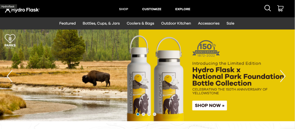 Let’s take a look at the website for Hydro Flask, a water bottle retailer. For starters, they have a very straightforward and easy-to-use navigation system that lets users quickly find the products they’re looking for. The navigation bar is broken down by product categories, helping people find exactly what they require in as few clicks as possible. The header also features rotating imagery that showcases some of their new products — in this case, their National Parks water bottle collection. Part of the draw of Hydro Flasks is that they’re colorful and tailored to the personality of the buyer, and the rotating images showcase the different beautiful colors the company has to offer, helping engage the visitor.
Think about how you can optimize your homepage design. Start by creating a navigation system that makes it easy for people to find what they’re looking for in just a few clicks. Then, choose imagery that shows visitors what you’re all about and helps engage them. This will encourage people to make a purchase!
Help people to convert in as few clicks as possible
When people land on your homepage, you want to make it as easy as possible for them to take the next step with your business — this will increase your chances of making a sale! Fortunately, there are a lot of different ways you can make it simple for your website visitors to find more information or make a purchase in just a few clicks. Here are some examples:
- Design a clear and clickable call to action (CTA) button that stands out against the background
- Provide a sophisticated search feature to direct people to the products or services they need
- Promote your most-loved items on your homepage
Let’s take a look at a business that implements this strategy well as inspiration.

Aura Imaging, a retailer of interactive aura camera products, makes it very easy for their visitors to order from them in just a few clicks.
When visiting the company’s homepage, a user is immediately greeted by a picture of the AuraCamera 6000, which is the company’s new photography system. And, if they are interested and ready to make a purchase, they can click the clear CTA, which says “Order Now.” This makes it very clear to website visitors where they need to go next to make a purchase with Aura Imaging, helping them quickly convert.
If you have a popular or impressive product that people often come to your website for, consider attaching a CTA to your homepage that directs the user to purchase it immediately. This will help people quickly convert and ensure that your website visitors have a great experience of shopping with your business.
Use reviews to allow past customers to vouch for you
Customer reviews are very effective for grabbing people’s attention, earning their trust, and ultimately pushing them towards a sale. This makes them perfect for adding to your website’s homepage!
Consider reaching out to your past customers via email to see if they would be willing to leave a review for a recently purchased product or service, perhaps in exchange for a small discount as incentivization.
Then, once you have your reviews, post them on your website. Choose reviews that highlight the features or benefits of your service that you want to highlight. Or, if you have a lot of products in a particular category, star reviews are an excellent option that will help people quickly and easily compare your offerings. On the other hand, if you offer services, written or video testimonials can provide more context as to what your business is capable of providing. If you already have a dedicated page for your reviews, pick some of your most recent favorites and post them near the top of your homepage for the best results.
Let’s look at a business that does a great job of utilizing reviews on its homepage so you can get some pointers.
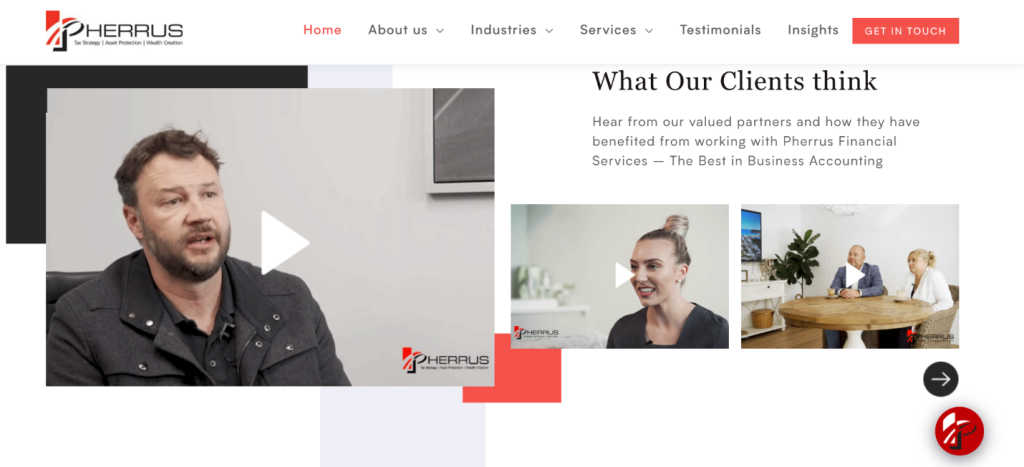
Pherrus Financial, a business accounting company, has excellent video testimonials on its homepage. In the interviews shown in these videos, past and current clients outline what services they used and why they found them helpful. These offer a lot of context and show prospective customers exactly what the company is capable of.
This is a great way for Pherrus Financial to optimize its homepage, as website visitors scrolling through will be able to get an idea of what the company is capable of doing, straight from the mouths of clients just like them.
You could also show off videos of your past clients praising your work on your homepage! This will give website visitors a place to hear about just how good your products or services are before they try them out for themselves. Testimonials like this can go a long way in building trust with customers and leading to a purchase!
Use homepage imagery that will get visitors excited
Strong visuals are important for grabbing people’s attention and showing them what your business is all about. You can use imagery to put a face to your business, show people what it’s like to work with you, or show off your brand’s personality, for instance.
People who land on your website need to immediately feel excited about the products or services you have to offer, and the right imagery can really help with this! Consider taking pictures of your team, showcase your products or services in action, or provide behind-the-scenes shots of your business. This will get them to imagine themselves using your products or services and make them more likely to buy from you.
Let’s take a look at a company with excellent homepage imagery to give you some inspiration.
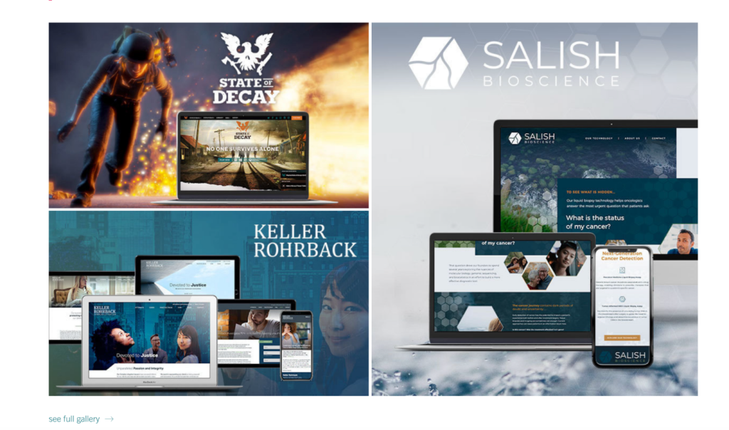
Bizango, a web design company based in Seattle, has a ton of great imagery on its homepage. Here, they showcase lots of different examples of the fantastic websites they’ve created for their past clients. They have also made sure to show what they look like on multiple devices, including desktop computers and mobile phones, to give visitors a real idea of their skill level. This imagery engages the viewer and helps them imagine what Bizango could do for their own company, which will make them more likely to spend money on the services.
Consider using imagery to show off the results you’ve been able to achieve for past clients on your website. For instance, a hair salon could show some of the hairstyles they’ve created, or a personal trainer could show off the weight loss results of their clients. This will help new website visitors imagine what you can do for them, making them more likely to make a purchase.
Showcase awards or qualifications that prove you’re reputable
People will only want to spend their hard-earned money with you if you’re able to earn their trust, so it’s important that you make a real effort to do this. As a result, if you have received any impressive accolades or awards, shout about them on your homepage! This will help you stand out from the competition and get people excited about the prospect of investing in your impressive products or services.
If you aren’t sure how you can score some awards or nominations for your business, check out Awards Finder. They can help you search through thousands of industry awards so you can apply and potentially win some respectable awards.
Then, once you’ve been recognized for your great work, you can post your official badge or award on your homepage.
Let’s look at a business that does a great job of highlighting its industry awards as inspiration.
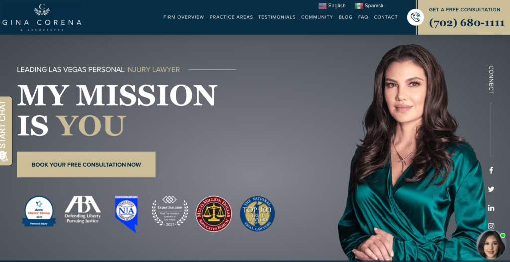
Gina Corena & Associates, a personal injury law firm based in Las Vegas, highlights some of its most impressive industry awards on its homepage.
As you can see above, the firm has received awards for car accident litigation, trial litigation, and more. And, highlighting these at the top of their homepage where people can see them is a great way to ensure that people who aren’t familiar with the business are impressed. These awards help build trust with visitors and will encourage people to become clients.
Consider showing off any awards you’ve won or been nominated for on your homepage. Post the relevant logo or badge towards the top of your homepage to ensure that they’ll be seen by all of your website visitors. If you do this well, people will be more likely to trust you and become loyal customers.
Make sure your homepage copy is genuinely helpful
The copy you publish on your homepage is extremely important — it can help you make or break a sale! To craft homepage copy that is genuinely helpful to your customers, you want to start by outlining the benefits of your products or services. This is different to outlining the features, like any tech specs or price points. When determining what benefits to highlight, think about how you help your customers. Do you save them time or money? Do you improve their lives? Do you make them happier? Answering these questions and exploring these benefits on your homepage will ensure that you’re providing genuinely helpful copy.
Let’s take a look at a business with great homepage copy as inspiration.
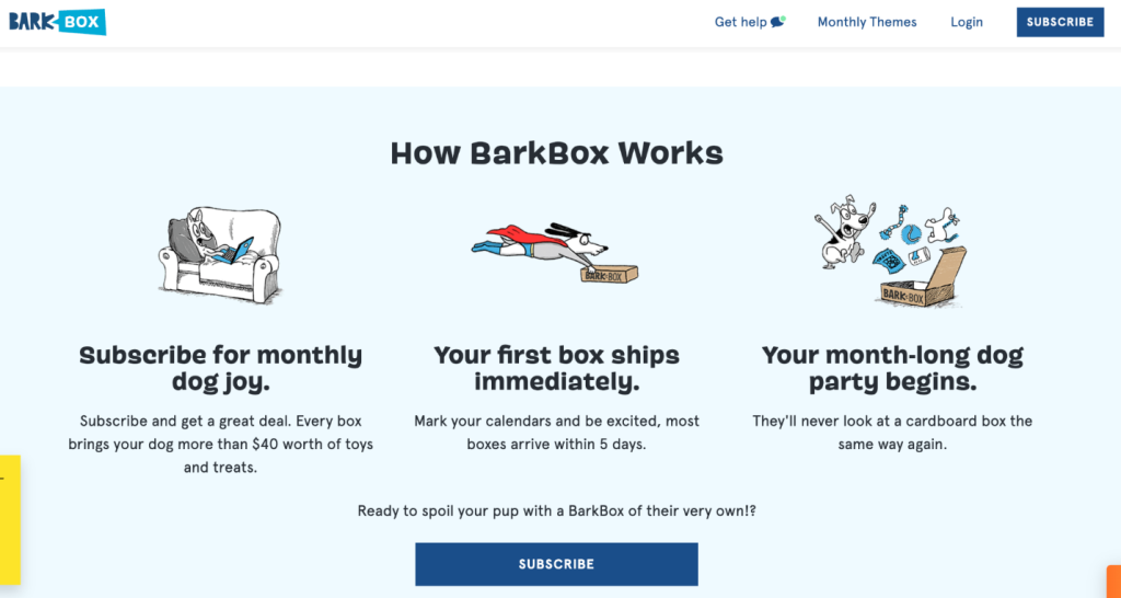
BarkBox, a dog toy and treat subscription service, has a ton of excellent copy across its website, and particularly on its homepage. Website visitors can read the copy and see that BarkBox can make them happier, save them money, and save them time buying dog toys and treats. With dog puns and playful copy, BarkBox also shows that it’s a fun company that just wants to ensure their customers and their dogs have a good time. Furthermore, in the “How BarkBox Works” section, the company provides helpful details, like the amount of money their customers can save and how long it will take for their box to arrive.
Be sure to write homepage copy that describes what you’re all about and proves to website visitors that you can assist them, as BarkBox has done on their website. Your homepage copy should work to sell your products or services, and proving how you can help is a great way to do just that.
Summary
In this article, we outlined how you can optimize your website’s homepage. After all, you want to make a great first impression! We covered writing helpful homepage copy, using great imagery, having a clean and effective web design, and more.
With our tips in mind, take a look at your own homepage and consider where there’s room for improvement. It’s sure to pay off!
–
Author bio & headshot:
Adam Steele is the COO at Loganix, an SEO fulfillment partner for agencies and marketers. We build easy-to-use SEO services that help businesses scale. If you liked this article, please check out our SEO guides and templates on the Loganix blog.


