Creating a distressed image effect is a powerful way to add character, age, and emotional depth to otherwise clean and modern visuals. Whether you are designing a vintage poster, a grunge-style social media graphic, or a textured background for digital art, a distressed look can introduce grit, authenticity, and tactile realism. Paint.NET, a free yet highly capable image editing tool, provides all the essential features you need to achieve this effect with precision and control.
TLDR: To create a distressed image effect in Paint.NET, combine texture overlays, noise, layer blending modes, and erasing techniques. Use built-in effects like Add Noise and Gaussian Blur, and experiment with blending modes such as Multiply and Overlay. Apply textures strategically and soften them for realism. With careful layering and subtle adjustments, you can achieve a convincing, professional distressed look.
Understanding the Distressed Effect
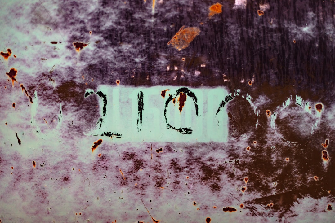
A distressed image effect simulates wear and tear—scratches, faded ink, dust, cracks, or uneven surfaces. The key to a convincing result lies in imperfection. Real-world objects age unpredictably, so your digital design must avoid uniformity.
Before starting, define your goal:
- Vintage print style? Faded ink and paper grain.
- Industrial grunge? Scratches, dirt, and heavy contrast.
- Subtle aging? Slight texture and muted colors.
Clarity in your creative direction will help guide the intensity of textures and blending choices.
Step 1: Prepare Your Base Image
Open your desired image in Paint.NET. This may be a logo, photograph, typography piece, or illustration. If you are working with text, it is advisable to:
- Create text on a separate layer.
- Duplicate the layer before making major changes.
- Keep a clean backup for comparison.
Working non-destructively ensures you can adjust the effect without losing the original design.

Organize your layers clearly. Rename them (e.g., “Base Image,” “Texture 1,” “Scratches”) so that edits remain manageable as your project evolves.
Step 2: Add Texture Layers
Texture is the foundation of any distressed effect. You can use scanned paper textures, grunge overlays, concrete surfaces, or subtle grain images. High-resolution grayscale textures generally provide better control.
To apply a texture:
- Open the texture image in Paint.NET.
- Copy and paste it into your main project as a new layer.
- Resize and position it to cover the entire canvas.
Next, adjust the layer’s Blending Mode. In Paint.NET, this can be found in the Layers window. Common choices include:
- Multiply – Darkens and integrates texture naturally.
- Overlay – Increases contrast while preserving highlights.
- Screen – Useful for lighter dust effects.
Reduce the layer Opacity to prevent the effect from becoming overwhelming. Subtlety is often more convincing than heavy application.
Step 3: Create Natural Wear with Layer Masking Techniques
Although Paint.NET does not offer native layer masks like some professional software, you can simulate masking by using the Eraser Tool creatively.
Choose a soft, textured brush (if available via plugins) or lower the hardness and opacity of the default brush. Gently erase portions of your top layer to create uneven wear patterns. Focus on:
- Edges and corners
- Areas of high visual tension
- Random scattered patches
Avoid symmetrical or evenly spaced erasing. Distress effects should feel organic.
Step 4: Use the Add Noise Effect
Digital images often look too smooth. Introducing controlled noise can break this perfection.
Go to Effects > Noise > Add Noise. Adjust the following:
- Intensity: Keep it moderate to avoid pixelation.
- Color Saturation: Lower values create realistic grain.
- Coverage: Controls how widespread the effect is.
For best results, add noise on a duplicate layer rather than directly on your primary image. Then lower opacity or experiment with blending modes to refine the look.
Step 5: Apply Blur for Realism
Real-world wear does not produce razor-sharp damage. After applying textures or noise, slight blurring can make the result more natural.
Navigate to Effects > Blurs > Gaussian Blur. Apply a small radius—typically between 1 and 3 pixels. This softens harsh edges in scratches or grain and integrates them into the base image.
Excessive blur will reduce clarity, so use restraint.
Step 6: Simulate Faded Color and Ink
Distressed images often feature reduced vibrancy or uneven color density.
To achieve this:
- Duplicate your base layer.
- Adjust brightness and contrast under Adjustments.
- Reduce saturation slightly.
You can also apply a subtle gradient overlay on a new layer set to Multiply to create lighting inconsistencies, mimicking fading caused by prolonged exposure to sunlight.
Step 7: Create Edge Wear
Physical materials deteriorate first at the edges. To replicate this:
- Select the Lasso Tool or Magic Wand Tool.
- Randomly select small irregular areas along the borders.
- Delete or reduce opacity within those selections.
You may also darken edges slightly using a large soft brush on a low-opacity black layer set to Multiply, creating a subtle vignette that enhances the aged impression.
Step 8: Add Scratches and Imperfections
For a more aggressive distressed look—particularly in industrial or grunge styles—add scratch or crack overlays.
- Import scratch textures as a new layer.
- Set blending mode to Screen or Lighten to remove dark backgrounds.
- Mask or erase unnecessary regions.
If needed, rotate or flip the texture to vary repetition. No visible pattern should be detectable, as repetition breaks realism.
Step 9: Control Contrast Carefully
One of the most common mistakes is excessive contrast. While distress often implies strong tonal variation, too much contrast makes the effect appear artificial.
Use Adjustments > Levels (if available via plugin) or Brightness/Contrast adjustments to fine-tune the final balance. The image should look worn—not digitally manipulated.
Professional Tips for Authentic Results
- Use High-Resolution Textures: Low-quality textures appear pixelated.
- Rotate Textures Frequently: Avoid recognizable patterns.
- Layer Gradually: Build distress in small stages.
- Zoom Out Regularly: The overall look matters more than minor details.
- Compare with References: Study real worn materials to observe natural aging patterns.
Common Mistakes to Avoid
- Uniformly applying texture across the entire image.
- Overusing noise or grain.
- Ignoring shadows and lighting consistency.
- Applying identical distress intensity to all elements.
Effective distress effects rely on variation. Some areas should remain relatively intact while others show heavier damage.
Saving and Exporting Your Image
Once satisfied, save your project in Paint.NET’s native format (.pdn) to preserve layers. This allows you to make future adjustments.
For final export:
- Use PNG for higher quality and transparency.
- Use JPEG for smaller file size when transparency is not required.
Ensure resolution matches its intended use—print projects require higher DPI settings than digital graphics.
Final Thoughts
Creating a distressed image effect in Paint.NET is less about complex tools and more about disciplined layering, subtlety, and careful observation. By combining textures, blending modes, noise, and erasing techniques, you can convincingly simulate age and imperfection. The key principles are restraint, realism, and intentional variation.
With practice, you will develop an intuitive sense for how much distortion produces authenticity without sacrificing clarity. Paint.NET offers more capability than many users realize, and when used thoughtfully, it can produce professional-quality distressed visuals suitable for branding, editorial design, posters, and digital art.
A distressed effect should feel organic—not forced. Approach the process with patience and precision, and the result will reflect both craftsmanship and artistic credibility.